"Step 3 of 7" is a lie when your form branches
A branching form has no honest denominator at step one. Three ways to show progress without inventing one — and what W3C suggests instead.
The question nobody asks before adding a stepper: seven out of what?
You have filled in this form. It opens with Step 2 of 5. You answer a question about company size, the form takes a different route, and the next page says Step 4 of 5 — a page you reached from step 2. Or the count grows instead: five becomes seven, seven becomes nine, and the bar you were watching slides backwards.
Nobody designed that. Somebody added a stepper because steppers look reassuring, and the denominator got filled in from the number of pages sitting in the editor. That number counts pages that exist. It does not count pages this respondent will see, and on a form that branches those are two different numbers.
There is no honest denominator at step one. So the real question is what to show instead.
Does a progress indicator actually increase completion?
The mechanism people are reaching for
The argument underneath every stepper is the goal gradient: effort rises as a reward gets closer. Real finding, real data. Kivetz, Urminsky and Zheng tested it in 2006 on a café reward card and a music-rating site, and in the café programme the gap between purchases shrank by roughly 20% — about 0.7 days — as customers closed on the free coffee.
The same paper carries the result people cite to justify fake progress: a 12-stamp card handed over with two stamps already on it gets completed faster than a plain 10-stamp card, though both need ten purchases.
Read that with a branching form in mind. It works because the denominator is fixed, visible and true. Twelve stamps means twelve stamps. The effect being borrowed to justify a made-up step count depends on the count not being made up — and none of that research is about forms anyway.
Being straight about the evidence
Search whether a progress bar increases form completion and you get percentages. A specific lift, stated flatly, no study attached. Follow the citation and it lands on another page that also has no citation, or on a vendor post quoting the first one. Nothing is measured at the bottom of the chain.
The honest version is duller: a progress indicator reduces uncertainty about how much is left. Uncertainty reduction is not a percentage, and this post is not going to add another number to the pile.
When it demonstrably hurts
The GOV.UK Design System starts from the other end. Test the form without an indicator first; if people struggle, fix the order, type or number of questions before reaching for a stepper. Their list of problems with elaborate steppers includes two that land squarely on this post: step labels are hard to write well, and conditional sections are hard to handle.
The under-reported failure is a large denominator shown to someone who has not committed. Step 1 of 14 on a cold landing page is not orientation. It is a price quote.
Why a branching form has no denominator
A structural claim, not a preference. It follows from where the logic lives.
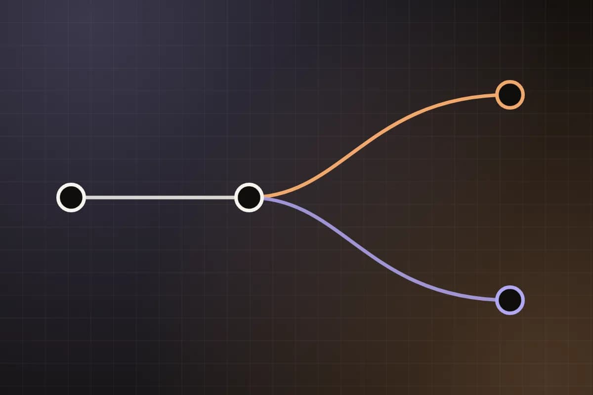
When logic lives between pages, the remaining path is not known until the current answer resolves
In Vellform, routing is a property of the page graph rather than of any one question: a rule whose target is a page sends the respondent somewhere other than straight on, and conditional logic is where the 10 operators for writing those conditions are documented. Rules that target a single field exist too — show, hide, make required — but they change what a page contains, not which page comes next.
So the set of pages a respondent will see is a function of answers that have not happened yet. Ask the editor how many steps a form is and the only correct answer is a range — with a distribution inside it you do not have until responses exist. That is not a gap waiting for a better feature. The number does not exist yet, and shipping something that prints one anyway is only a choice about which respondent to mislead.
Why single-page builders never hit this
If your builder renders every field on one long page and hides some with show/hide rules, you can always print a number: count what you rendered. That is a count of fields in the document, not steps this person will take. It looks like progress without measuring progress.
The two dishonest fixes and what they cost
Count every page in the editor, hidden branches included. The denominator is now too big for everybody. The bar advances in uneven jumps, and if you ever correct it — once a branch has been ruled out, say — it moves backwards. A progress bar that moves backwards turns a reassurance into a warning.
Recompute the total after every answer. More accurate, worse to sit through. Step 3 of 9 becomes Step 4 of 6. People notice a denominator changing far more than they notice a numerator advancing, and a shrinking total reads as a bug in your form rather than as good news about their path.
Both try to keep a promise that should not have been made.
Three honest options
Option 1 — percentage of the longest path
Walk the graph, find the longest route from the start to an ending, and show progress as a fraction of that. The bar can then only ever be pessimistic. Worst case, somebody finishes at 70% and submits early, which lands as a small gift. The opposite — 90% with three pages still to come — lands as a broken promise. That asymmetry is the whole reason to prefer this option.
Show a bar or a bare percentage. The moment you print 3 of 7 you have asserted a fact about the future.
Option 2 — count completed only
"4 questions answered." No denominator, so nothing to be wrong about. This is the right answer when path lengths diverge badly — a qualifying question that sends a third of people down a two-page route and everybody else down a nine-page one.
It reassures less. It also never falsely reassures, and where branches genuinely differ that is the better trade. Pair it with a named heading on every page and the count stops carrying the orientation on its own.
Option 3 — indeterminate progress
Nobody competing for this query mentions the third option, and it is sitting in the W3C's own multi-page forms tutorial. The tutorial names the HTML progress element specifically for the case where the number of steps depends on how the user answered — a survey where steps get skipped. Its own example hedges the step label with the word "circa".
The mechanics are in the element. A progress with a value is determinate; a progress with no value attribute is indeterminate — an activity is ongoing, with no indication of how long it will take. That is a fair description of a respondent standing at a split.
<!-- Option 1: a fraction of the longest path. Can only understate. -->
<label for="prog">Progress</label>
<progress id="prog" max="9" value="4">Page 4 of at most 9</progress>

<!-- Option 3: no value attribute, so the bar is indeterminate.
     Do not invent a max just to have one. -->
<progress aria-label="Working through your answers"></progress>Two caveats. The default indeterminate rendering animates continuously; the W3C tutorial flags that animation as an accessibility problem and supplies CSS to switch it off. And the bar carries no information by itself, so give it an accessible name and visible text beside it.
The decision rule
A rule of thumb, offered as one — a judgement call, not a tested threshold. If the longest and shortest paths through your graph differ by more than about 30%, do not print a denominator. Nine pages against six is 33%: no denominator. Nine against eight is 11%: print it, and let the occasional respondent finish a page early.
The 30% stands in for a question you can answer better than a rule can: when does finishing early stop feeling like a bonus and start feeling like the form was lying at the start? Walk your two extreme paths and watch the bar.
Making the indicator perceivable, not just visible
It is an orientation device, not decoration
The US Web Design System's step indicator marks the current step with aria-current on the list item, and the component ships the value true. ARIA also defines a step token, described for exactly this case: the current step within a process, such as an enumerated multi-step checkout. Both are announced; step is the more specific. Only one element in the set gets it.
The W3C tutorial gets there without ARIA, using visually hidden text: a "Completed" prefix on finished steps and a "Current" prefix on the one you are on. Either technique works. Doing neither leaves you with a decorative row of circles.
What colour cannot carry
USWDS is specific: give the current step a colour and a text treatment, distinct from both the completed and the pending steps, and make it the most prominent of the three. If the only difference between done and not-started is a fill colour, the indicator carries nothing for a share of your respondents — and nothing at all in a greyscale screenshot.
Should the steps be clickable at all
USWDS says the step indicator complements back/next navigation rather than replacing it. On a branching form there is a harder reason: jumping to step 5 assumes step 5 is on this respondent's path, and if an earlier answer changes, it may not be. A stepper that can strand somebody on a page their answers no longer route them through is worse than no stepper.
If you make them clickable anyway: completed steps only, route the click back through the graph rather than to a page id, and give the target a real hit area. WCAG 2.2's Success Criterion 2.5.8 Target Size (Minimum) asks for 24 by 24 CSS pixels at Level AA.
Where the step name goes
Put the progress in the page <title>. The W3C tutorial makes the point because the title is the first thing many screen reader users hear; its example leads with the step and the step's name, then the task, then the site. Mirror it in the h1.
This matters more than the bar does. "Shipping address (step 2 of 4)" tells somebody where they are; a filled rectangle tells them roughly how far. With no honest denominator the title still works — "Shipping address — Complete your order". A name beats a count.
The pattern that beats a progress bar for long forms
One question per page, each page named for what it asks, and a review step at the end. The GOV.UK service manual builds its form-structure guidance on splitting a form so each page holds one thing — one question, one decision, one piece of information. The person then always knows what is being asked right now, which is the question a bar answers badly and a heading answers exactly.
Orientation is not only "how far through am I". It is also "what have I told you" and "can I still change it". A bar answers neither. A review page answers both, and on a page graph it can show only the questions this respondent was actually routed past — the graph knows which pages they traversed, not merely which fields were hidden. End the form with a review step instead. It is one of four working page kinds and the page graph: Page, Cover, Review, Ending.
One last thread worth pulling. The same page graph that makes a step count unknowable is what decides which fields reach your webhook. A respondent who never walked a branch produces no keys for the questions on it, so your payload varies exactly as much as your step count does.
Questions people actually ask
- Should the progress indicator appear on the cover page?
- No. A cover page is a decision to start, not a step, and "Step 1 of 12" shown before anyone has committed is the case the GOV.UK guidance warns about. If the cover is not a step, keep it out of any total too.
- Is "Step 3 of 7" better than a percentage?
- Yes — when 7 is true. A count is more concrete than 43% and maps onto something a person can hold in their head. When 7 is not true, a percentage of the longest path is the safer wrong answer: it can only understate.
- What about a percentage that jumps around?
- Uneven jumps are tolerable; backwards movement is not. Compute the value from pages remaining on the current path rather than from field counts, and never let a recomputation lower a number you have already shown.
- Do I need a stepper for a three-page form?
- No. Three pages with clear headings and a working back button need nothing else. Start without an indicator and add one only if people are getting lost, which on three pages they will not be.
- How do I count steps when one branch is much longer than the other?
- Do not. That is the case for counting completed questions with no denominator, or for indeterminate progress. A total that is right for one branch and wrong for the other is worse than no total at all.
Sources
Every link below was opened and checked against the sentence it is cited for.
- 01Names the HTML progress element for the case where the number of steps depends on how the user answered, flags the default animation as an accessibility problem, and shows progress in the page title and in visually hidden "Completed" and "Current" step labels. W3C WAI — Multi-page forms tutorial
- 02Test without a progress indicator first; include a total only if you can do so reliably; and the list of problems with elaborate steppers, which includes conditional sections and hard-to-write step labels. GOV.UK Design System — Question pages
- 03Marks the current step with aria-current on the list item (the component uses the value "true"), asks for a colour and a text treatment rather than colour alone, and states that the indicator complements back/next navigation rather than being navigation itself. US Web Design System — Step indicator
- 04A progress element with no value attribute is indeterminate, indicating an ongoing activity with no indication of how long it is expected to take; plus the value and max semantics. MDN — the progress element
- 05The step token is defined as the current step within a process such as an enumerated multi-step checkout flow, and only one element in a set should carry aria-current. MDN — aria-current
- 06The 24 by 24 CSS pixel minimum target size at Level AA, cited for clickable step indicators. WCAG 2.2 Understanding — 2.5.8 Target Size (Minimum)
- 07Splitting a form across pages so each page contains one thing: one question, one decision, or one piece of information. GOV.UK Service Manual — Form structure
- 08The goal-gradient and illusionary-progress findings people cite when justifying steppers: interpurchase times fell by about 20%, or 0.7 days, as café reward-card customers approached the reward, and a 12-stamp card carrying two bonus stamps was completed faster than a plain 10-stamp card. The studies are reward programmes, not web forms. Kivetz, Urminsky & Zheng (2006) — The Goal-Gradient Hypothesis Resurrected
Vellform Engineering
We write about the parts of form infrastructure that only show up in production.